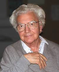
The news of the passing of Adrian Frutiger have left me with sadness and a deep void. His elegant, functional fonts have accompanied me since early youth; whenever there was something important to be written, I invariably set it in Frutiger, Avenir or Univers. «The white is just as important than the black», his credo was a revelation. The balance between «what is» and «what isn’t» is what distinguishes quality, not only in fonts. When it came to designing dials for Ventura watches, I avoided the usage of numerals for many years, because I disliked the unbalance between the single and the double digit hours. Finally, in 2002, I assembled all my courage to write a letter to Adrian Frutiger, describing my dilemma; and only a few days later I received a warm invitation to visit him at his humble house near Berne. The beginning of a wonderful collaboration and friendship. He was already frail and had great difficulties to guide his pen but when speaking of his idea to design the numerals of a watch dial as one unified typography, his eyes sparkled and his gestures became vivid. In a long letter dated January 25, 2004, he wrote about his vision, his lifelong quest for clarity, readability of signs and his scorn for famous watch brands grotesquely distorting their dial-numerals in helpless attempts to appear original. Our collaboration resulted in the creation of the «myEGO Frutiger» timepiece combining Adrian’s matchless, iconic watch-dial with Hannes Wettstein’s micro-architectural case-design. Wikipedia describes his great accomplishments and letting the world realize that it has lost a monument. Reading it today felt strange; for all its correctness, this is not about the Adrian Frutiger I had the privilege to know, an immensely human and modest friend, whom I shall miss. Yet, I know that whenever I check the time on my watch with his dial, there will be a mildly smiling Adrian Frutiger looking over my shoulder.
September 2015
Pierre Nobs


